The Ravensridge Press has released a Solo RPG Playing Card oracle. The link goes to itch.io's page where you can get (currently) the pdf of the tool and either use it from the pdf directly1 or print-and-play. A physical version is either coming or is out [text varies between the two pages].
Mild Disclaimer: After purchasing it, I requested they release a copy of images which would make it possible to load the cards in VTTs or to build scripts to draw them, etc.
These are $10 [usd] for a 54-card deck that matches a traditional poker deck (13 cards per suit, 4 suits, 2 jokers) though the cards have additional content than this [see card overview]. The physical version shows up as €17,95 for me. That seems too round to be a proper conversion so I am unsure what it might be for other regions. Around that. Shipping not included.
Prior to this review, I used to play a nice, quick side story to The GLOW 1992: The GLOW 1992: Side Story, Berg & Erzse. If you want to see how I used them, that's a fair demo.
Card Overview
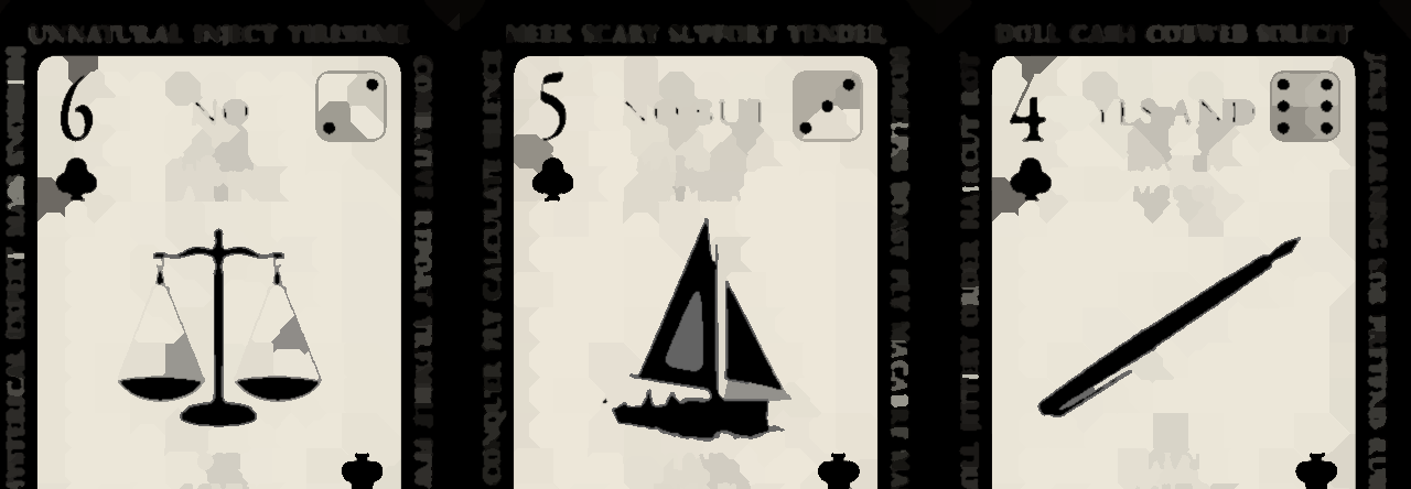
The majority of cards have:
- Traditional element of the card [suit and rank]
- An icon
- Yes/No + And/But results
- Four real world (?) names from a variety of backgrounds
- A plethora of prompt words in the margin
- Two different d6 results
You can pull a card [or two] and then look at any of those elements to come up with answers. This includes coming up with your own add-ons. Something like clubs = wary, hearts = friendly, spades = hostile, diamonds = curious. Then pull a card to generate a reaction roll.
There are two jokers [one red, one black] that have some words, some blacked-out text, and that's about it. Despite the effect, you can still read the text (are you supposed to use it? no clue). No dice. There's an icon but it's behind the text and is not quite the same. No names.
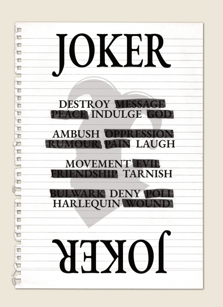
How jokers are meant to be used is unknown, but for the most part Ravensridge just presents the deck as a whole for you to find your path with them.
The icons look to be sourced from Picasa/Canva [I've used such enough that I recognized a couple pretty quickly] or a similar tool's repository. While I love the gameicons.net folk, it is nice to see some different icons in the solo space.
Review
This is a technical enough review that I feel like I can best express it by breaking it down into Pros, Cons, and something I'm going to call "Wishlist" that irons that out just a tad.
Pros
The center of the card elements [where you have Suit, Rank, Names, Yes/No, Dice, and Icon] are nicely streamlined. You get a fair amount of information at a glance.
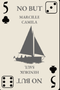
The use of traditional card suits and ranks means as a tool it fits into the fair-sized space of solo rpgs and adjacent tools that use card decks. In this case, these are value added.
The icons are varied in context and theme. They are clear and mostly easy to see [2♢'s flower and Q♡'s whelk(?) shell are potentially confusing]. They are the kind of image prompts that can be taken literally [e.g., "There's a candle burning in the room."] or figuratively [e.g., "Something is burning, you smell smoke."]. I talk in brief about using icon- and image-based oracles in my Tricube Image Oracles and Dixit Cards pages.
As said above, I like the fact that these are fairly unique to the space, at least based on my experience.
Cons
The cons are going to take up more space on the page. They are not as important to me as the good things, but while the good things are pretty self-explanatory, the issues are not quite so obvious and need a bit of math and psychology.
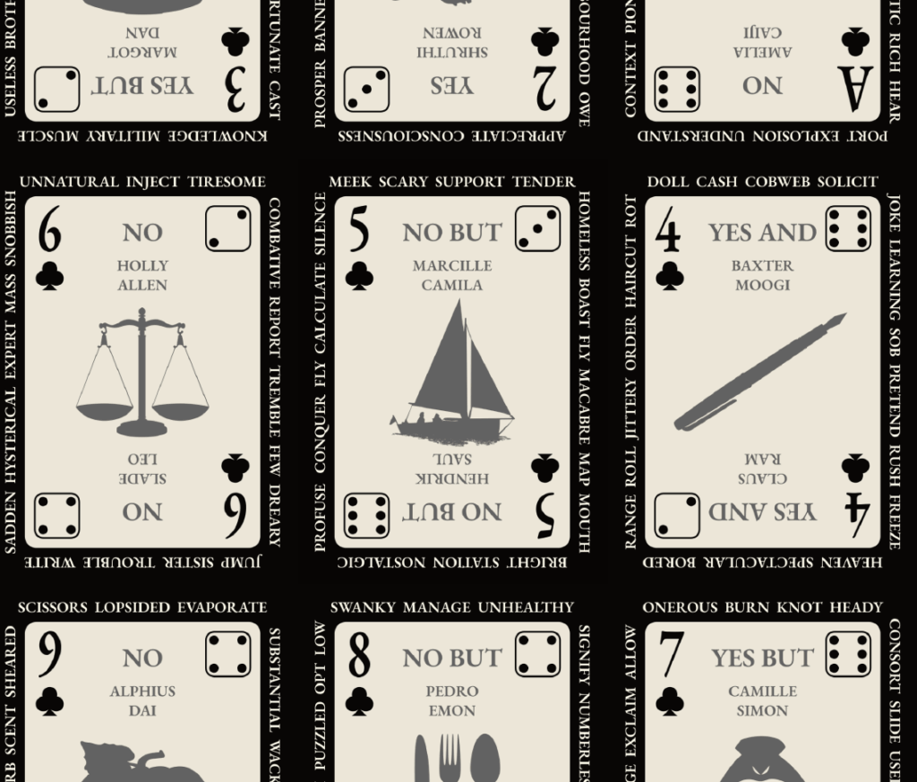
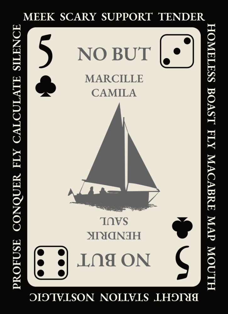
By contrast to the very well designed center portion, the outer portions of the cards (with the prompt words) are entirely too cluttered.
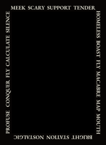
Words press together with little organization besides word length. In the above example [extracted from the 5♣], the word "fly" shows up twice. Other words might repeat as well. How often and in what configuration, I do not know.
Since the purpose of this part of the oracle is to take a word that jumps out at a glance, having some words with more space means your eyes are going to align to them more often. In the above, "profuse" [in the bottom left] has more breathing room than "homeless" [top right]. How much this impacts actual use is up for some debate, but in practice I meant I had to rest my eyes and then read multiple words before I let one "stick out" to me.
The other con is perhaps less a con for some: 52 cards is not a multiple of 6. Had there been dice icons on the joker cards, then the distribution of 1-6 [dice results] would have been even. Instead, you get an uneven distribution of both numbers and answers. See "Looking at the Distribution," below, to see how it works out. 3s and 4s are the most common number, slightly. There are equal numbers of Yes/Nos as their "But" counterparts, but far fewer Yes, Ands and No, Ands.
The latter is a design choice. Using this oracle means you will get a lot of "yes," "no," "yes, but," and "no, but" answers but few "..., ands." Good for people who like a lot of little twists and plain answers, maybe not suited to those who prefer a different mix. That is up to you.
The former, though, is possibly problematic. While 2d6 solves towards 7 with each d6 solving towards 3.5 across enough rolls, building that into the oracle itself does flavor rolls towards middling. Since there are 36 middle values versus 34 low values and 34 high values, the impact is likely very minor. Instead of there being a 16.7% chance you will get a 3, there's a 17.3% chance. Instead of a 16.7% chance you will get a 6, there's a 16.3% chance.
Again, minor, but there. It is perhaps more felt if you are using d66-type oracles than emulating a 2d6 roll.
There's also another slight hiccup in that to get a better mix of dice results and prompt results, you need to have cards regularly flip over so you are getting some "inverted" cards. Only icons face up one way so you will have a natural tendency to sort them into a single orientation. This is only a quibble, though.
Wishlist
If there was ever a second edition of these, the two things I would like to see [with a potential third item] would be:
- Dice icons on the jokers to make the number distribution even.
- Only maybe 2 or 3 sparks words per side of card with perhaps a few more sensory sparks added in [e.g., colors, sounds, etc].
- [more optional] the prompts perhaps organized more around the theme of the icon.
For #3, I do not mean that it makes the sparks useless when you could just use the icon, just thematically attached. For instance, 8♣ has an icon of a fork/spoon/knife set. Sparks could dance around that: food, silver, stab, split [aka, "fork in the road"], spoiled [aka, "silver spoon"], betray [aka, "knife in the back"]. That sort of thing.
This would transform them to closer like something like a tarot reading, but not quite.
Finally, a bonus #4: I'd like to see more credits in the document. I know a lot of this style of stock art doesn't need full attribution and such, but even just a few blurbs about where these are from and where some elements are derived would help to put them into a perspective. There's not even in the name Ravensridge in the opening page which has some steps on how to use them. It gives it a work in progress vibe.
Final Thoughts
I think these definitely will fit right into some folk's rotation nicely.
As for me, I enjoyed using them and can see myself bringing them out occasionally when there is a benefit to having card suits and ranks (such as Tricube Solo, though I'd be technically missing two jokers but that doesn't phase me too much). I tend to like an even distribution of yes/no and then fewer and/buts that are evenly distributed among themselves. However, variation does not irk me. It simply limits where I think they would best fit.
The $10 price tag is not too steep but for that I'd lean more towards a more thematic Gamemaster Apprentice Deck if I could only choose one.
Couple of Quick Tips
One, these work fairly well with Likely and Unlikely. Just draw two cards. Draw two and then take the highest/lowest result.
I treated the jokers as more akin to twists than worrying too much about the text on them. If you draw a joker, draw another card to explain the twist.
Looking at the Distribution
- 1s & 2s: 17 of each
- 3s & 4s: 18 of each
- 5s & 6s; 17 of each
- Yes & Yes, But: 12 of each
- No & No, But: 12 of each
- Yes, And & No, And: 2 of each
Credits
All images are taken from Ravensridge Press's Solo RPG Playing Cards as linked above. With the exception of the (black) joker, all art is visible on the itch.io page as part of a sample.
- How I used them was drew from a regular deck of cards and then looked them up on the pdf. ↩︎